

Apparently it is possible :). Client is King as the saying goes, but it was very hard for me to get my head around the idea that I will deliver a logomark that steps outta regular bound of what I woudl normaly consider good design. And I did get my first "Double Thank You" (coined by Chris Do), where the client not only pays you, but goes to distance by calling and saying "Thanks, that was very good experience for us"
Originaly I went with very "gamming like concept", that you can see on the stylescape bellow. But that just became a second idea that gor rejected and I started to despair a little.

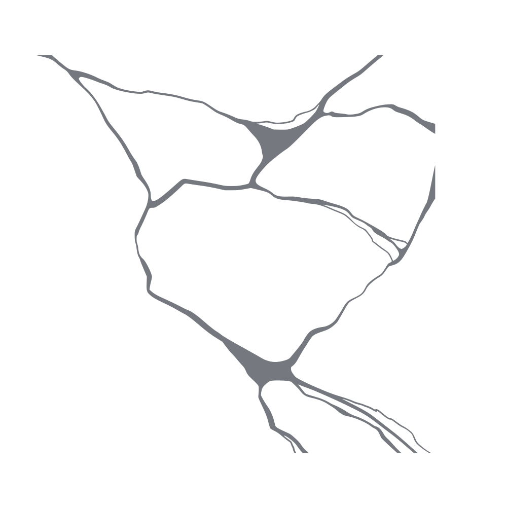
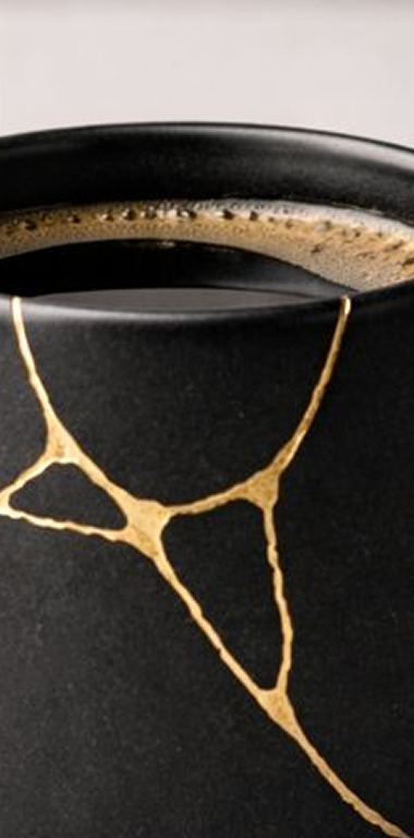
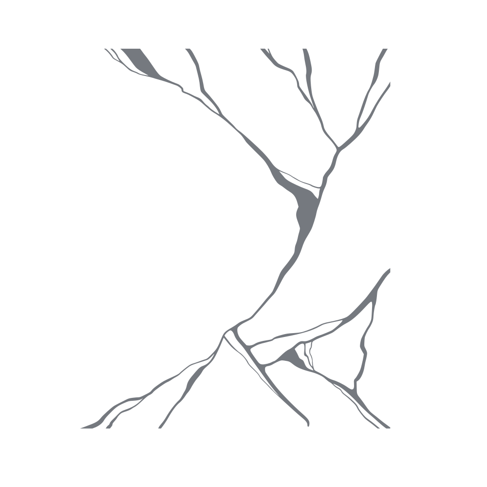
The idea of the gym is based on concept of ANTIFRAGILITY, which I translated into visual interpretation as KINTSUGI pattern, where the thing is first broken, but then mended together again and it grows stronger in the process.
For the last and finally succesfull concept, I went back to the drawing board and to the projects' main values. The final logo is a simple mark showing kind of exponention hyperbolic growth and connecting the letter C + V + X. I was very reluctant first to go this way, because the final logo is asymetric, left-heavy and simply is not pleasing by the usual design standarts. However... this is exactly what the client loved. They said "Look, we are all about asymetry, growth, adaptability and pressure"
For myself, I am very excited where will the project grow and whether this logo and design will have to grow as well, for what I have learned, nothing stays the same and trying to create timeless design is in my mind an exercise in futility.
